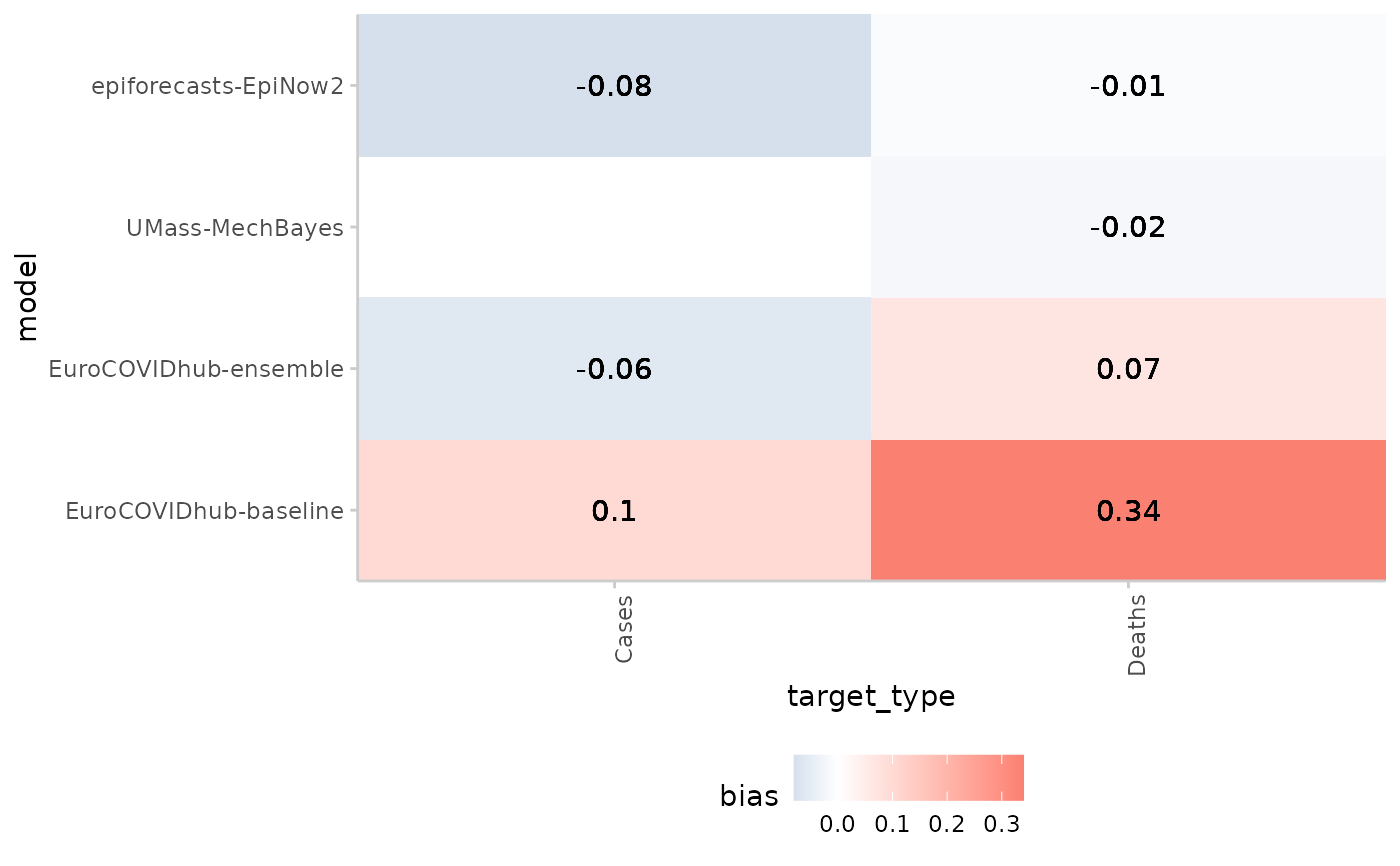
This function can be used to create a heatmap of one metric across different groups, e.g. the interval score obtained by several forecasting models in different locations.
Arguments
- scores
A data.frame of scores based on quantile forecasts as produced by
score().- y
The variable from the scores you want to show on the y-Axis. The default for this is "model"
- x
The variable from the scores you want to show on the x-Axis. This could be something like "horizon", or "location"
- metric
String, the metric that determines the value and colour shown in the tiles of the heatmap.
Examples
scores <- example_quantile |>
  as_forecast_quantile() |>
  score()
#> ℹ Some rows containing NA values may be removed. This is fine if not
#>   unexpected.
scores <- summarise_scores(scores, by = c("model", "target_type"))
scores <- summarise_scores(
  scores, by = c("model", "target_type"),
  fun = signif, digits = 2
)

plot_heatmap(scores, x = "target_type", metric = "bias")