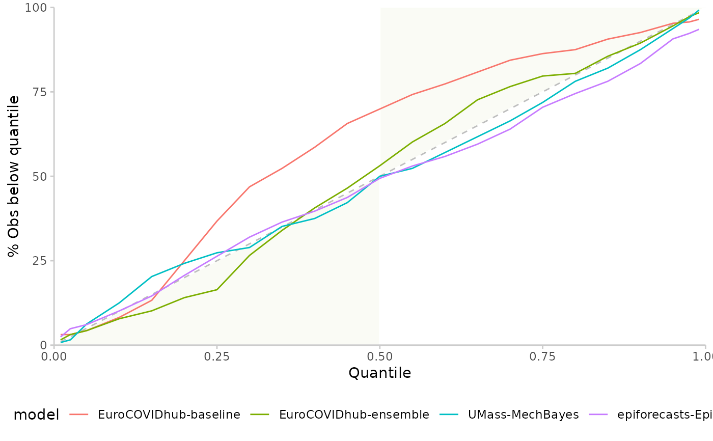
Plot quantile coverage values (see get_coverage() for more information).
Arguments
- coverage
A data frame of coverage values as produced by
get_coverage().- colour
String, according to which variable shall the graphs be coloured? Default is "model".
Examples
example <- as_forecast_quantile(example_quantile)
#> ℹ Some rows containing NA values may be removed. This is fine if not
#>   unexpected.
coverage <- get_coverage(example, by = "model")
plot_quantile_coverage(coverage)