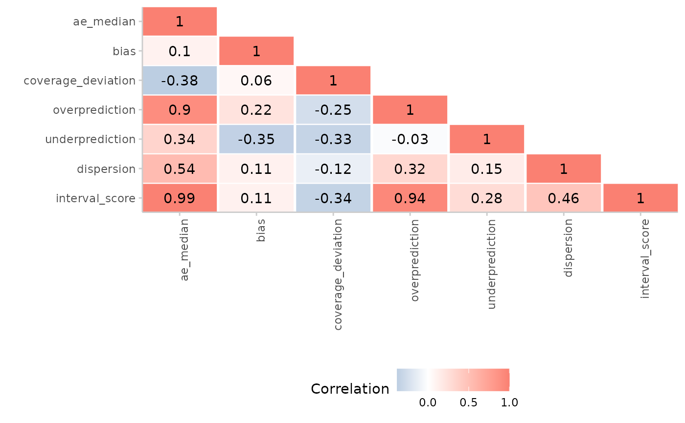
Plots a heatmap of correlations between different metrics
Arguments
- correlations
A data.table of correlations between scores as produced by
correlation().
Examples
scores <- score(example_quantile)
#> The following messages were produced when checking inputs:
#> 1.  144 values for `prediction` are NA in the data provided and the corresponding rows were removed. This may indicate a problem if unexpected.
correlations <- correlation(
 summarise_scores(scores)
)
plot_correlation(correlations)