Visualise the metrics by range, e.g. if you are interested how different interval ranges contribute to the overall interval score, or how sharpness / dispersion changes by range.
Arguments
- scores
A data.frame of scores based on quantile forecasts as produced by
score()orsummarise_scores(). Note that "range" must be included in thebyargument when runningsummarise_scores()- y
The variable from the scores you want to show on the y-Axis. This could be something like "interval_score" (the default) or "dispersion"
- x
The variable from the scores you want to show on the x-Axis. Usually this will be "model"
- colour
Character vector of length one used to determine a variable for colouring dots. The Default is "range".
Value
A ggplot2 object showing a contributions from the three components of the weighted interval score
Examples
library(ggplot2)
scores <- score(example_quantile)
#> The following messages were produced when checking inputs:
#> 1. 144 values for `prediction` are NA in the data provided and the corresponding rows were removed. This may indicate a problem if unexpected.
scores <- summarise_scores(scores, by = c("model", "target_type", "range"))
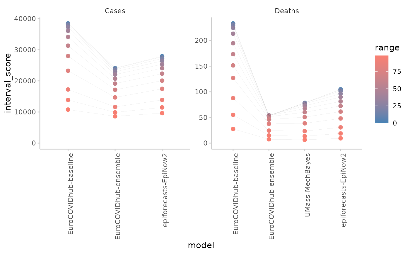
plot_ranges(scores, x = "model") +
facet_wrap(~target_type, scales = "free")
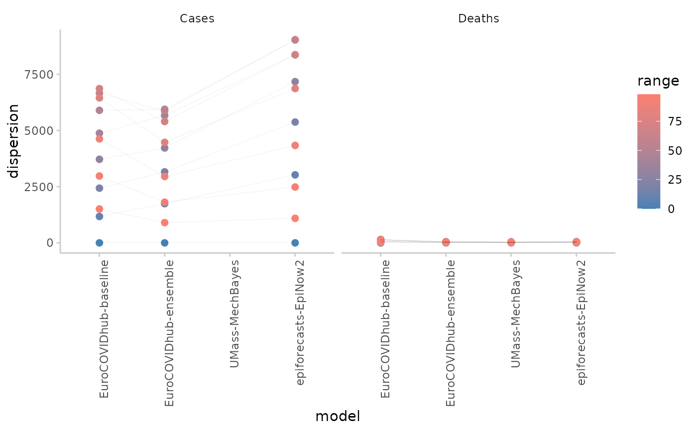
 # visualise dispersion instead of interval score
plot_ranges(scores, y = "dispersion", x = "model") +
facet_wrap(~target_type)
# visualise dispersion instead of interval score
plot_ranges(scores, y = "dispersion", x = "model") +
facet_wrap(~target_type)