Plots a coloured table of summarised scores obtained using
score().
Arguments
- scores
A data.table of scores as produced by
score().- y
the variable to be shown on the y-axis. Instead of a single character string, you can also specify a vector with column names, e.g.
y = c("model", "location"). These column names will be concatenated to create a unique row identifier (e.g. "model1_location1").- by
A character vector that determines how the colour shading for the plot gets computed. By default (
NULL), shading will be determined per metric, but you can provide additional column names (see examples).- metrics
A character vector with the metrics to show. If set to
NULL(default), all metrics present inscoreswill be shown.
Examples
library(ggplot2)
library(magrittr) # pipe operator
# \dontshow{
data.table::setDTthreads(2) # restricts number of cores used on CRAN
# }
scores <- score(example_quantile) %>%
summarise_scores(by = c("model", "target_type")) %>%
summarise_scores(fun = signif, digits = 2)
#> The following messages were produced when checking inputs:
#> 1. 144 values for `prediction` are NA in the data provided and the corresponding rows were removed. This may indicate a problem if unexpected.
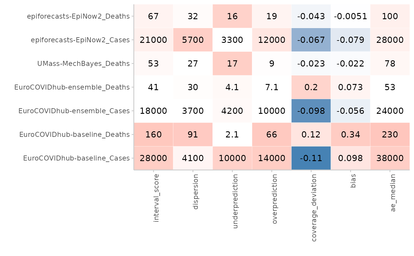
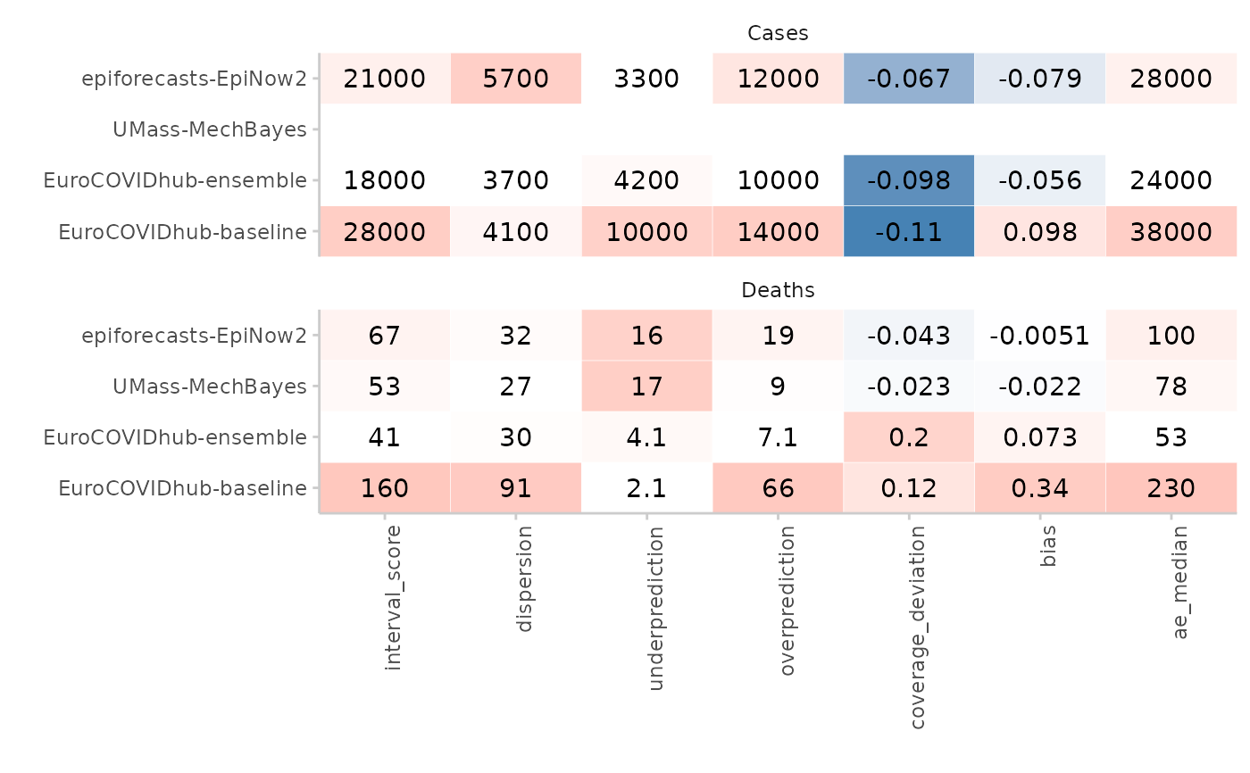
plot_score_table(scores, y = "model", by = "target_type") +
facet_wrap(~target_type, ncol = 1)
 # can also put target description on the y-axis
plot_score_table(scores,
y = c("model", "target_type"),
by = "target_type")
# can also put target description on the y-axis
plot_score_table(scores,
y = c("model", "target_type"),
by = "target_type")