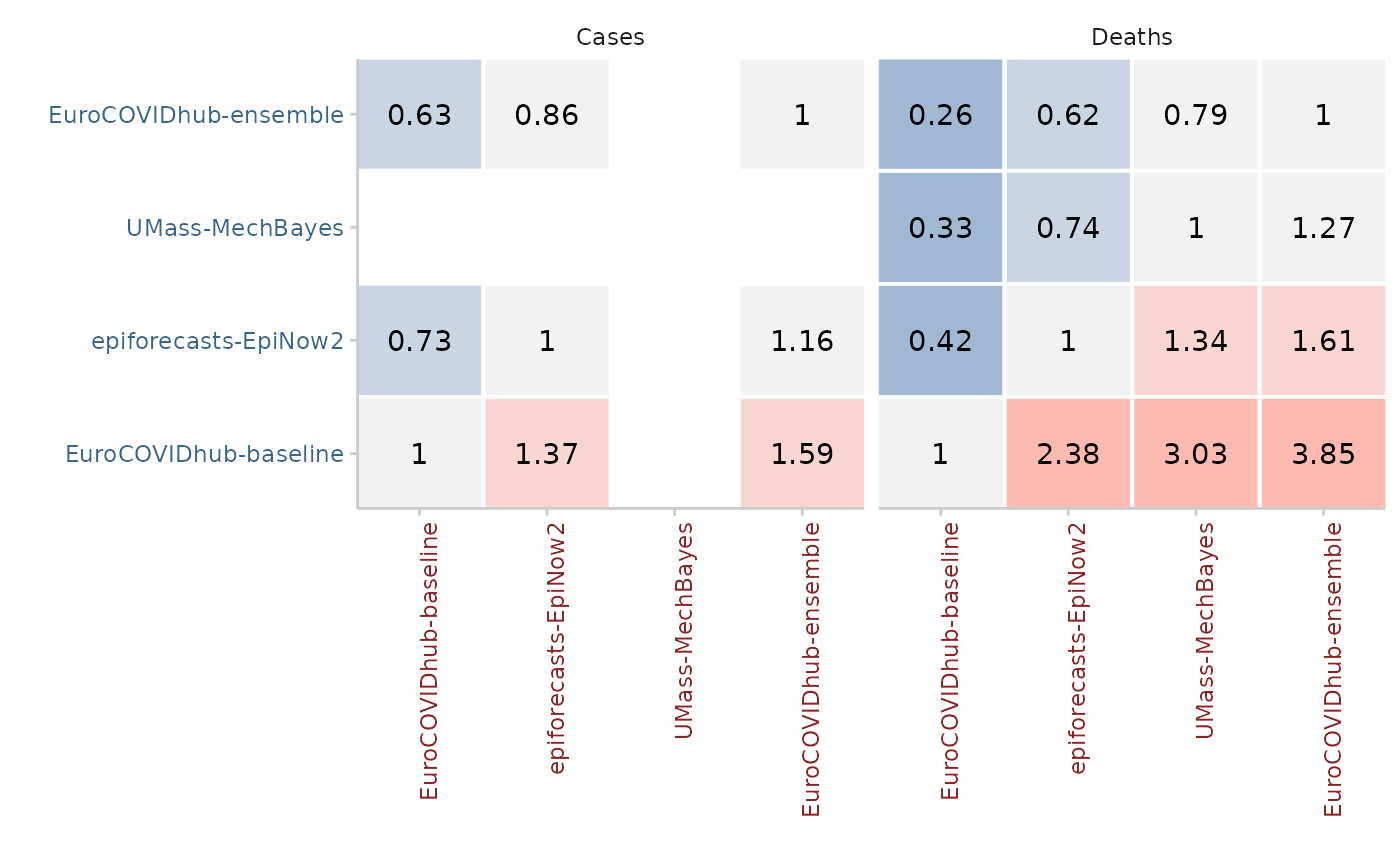
Creates a heatmap of the ratios or pvalues from a pairwise comparison between models
Usage
plot_pairwise_comparison(
  comparison_result,
  type = c("mean_scores_ratio", "pval")
)
Arguments
- comparison_result
A data.frame as produced by
pairwise_comparison()- type
character vector of length one that is either "mean_scores_ratio" or "pval". This denotes whether to visualise the ratio or the p-value of the pairwise comparison. Default is "mean_scores_ratio".
Examples
library(ggplot2)
scores <- score(example_quantile)
#> The following messages were produced when checking inputs:
#> 1.  144 values for `prediction` are NA in the data provided and the corresponding rows were removed. This may indicate a problem if unexpected.
pairwise <- pairwise_comparison(scores, by = "target_type")
plot_pairwise_comparison(pairwise, type = "mean_scores_ratio") +
  facet_wrap(~target_type)